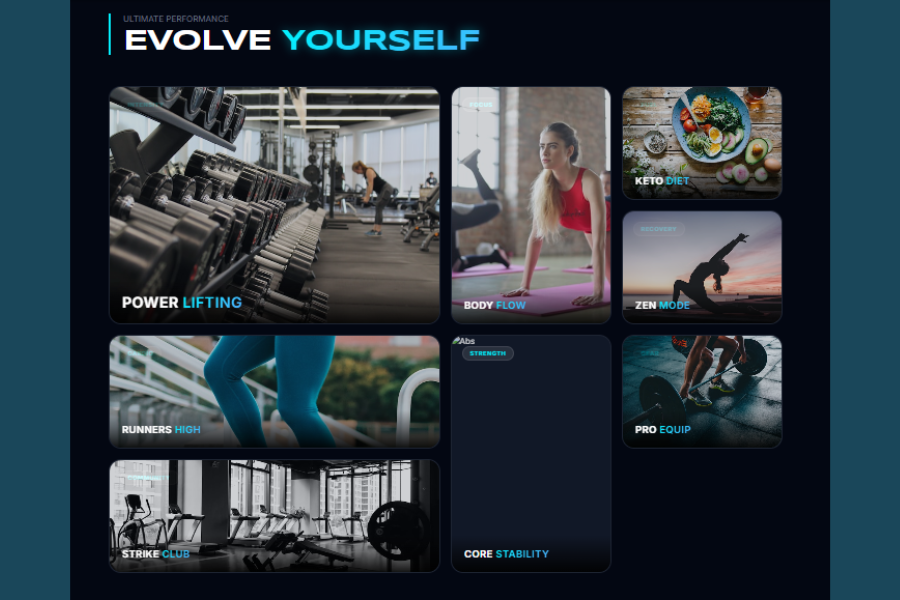
Welcome to TechTimesGlobal.This is a stunning Elite Fitness Bento Gallery made with HTML and CSS. It aims to display fitness-related topics, such as workout, diet, recovery, and training styles in a contemporary and visually appealing manner. The layout is based on an idea known as Bento Grid Layout, where content is laid out in varying sizes and shapes to create an interesting and captivating user experience.
As web design continues to evolve, minimalistic designs are being replaced by more experimental designs. This gallery is a case in point. It doesn’t list the photos in a simple grid, but displays them in cards of various sizes, with hover effect, glowing edges and typography.
The purpose of this project is not only to show images, but to convey a feeling and excitement for fitness. Neon colors, dark background and typography create a powerful and energetic vibe. This style is often seen in fitness sites, gym landing pages and portfolio pages.
HTML Structure
The webpage structure is defined by the HTML. It begins with a basic HTML5 doctype, making it compatible with modern browsers. The tag has a language attribute, specifying English, which is good for accessibility and search engine optimization.
Within the element, there are key meta tags. This ensures the page is rendered correctly on various devices, particularly mobile. It also sets the title of the page that is shown on the tab. Google fonts are loaded to improve the typography, making it look fashionable.
The is the main content of the page. It has two main elements: the header and the bento grid.
The header section sets the page’s theme. This part includes a small subtitle and a large heading. The header has uppercased text and a key word that is highlighted. This part serves as an introduction and establishes the theme of the page.
The body of the article is contained within a bento grid. The grid contains several cards, which represent various types of fitness like lifting, cardio, diet, recovery and so on.
Each card contains an image, category tag and title. The tag is placed in the top corner of the card to give a brief description. The card is filled with an image, which makes a great impression. The title at the bottom includes a keyword, which is highlighted.
The size of cards can vary. This class is applied using the classes such as large, tall, and wide. These classes determine how much larger or smaller the card will be in the grid, resulting in a distinctive look.
CSS Style
The CSS section is responsible for giving the gallery a modern, stylish and interactive appearance. It adopts a dark theme with neon accents to make it vibrant and impactful.
The page’s body is given a dark background. This makes the images and neon accents pop. The content is spaced out with padding.
The header is given a gradient border and large text. The accent text is made neon with a glow, creating a vibrant look. The typography also contributes to the luxury look.
The bento grid is achieved with CSS Grid. This layout has four columns and auto row heights. The grid enables the cards to be positioned flexibly to achieve various sizes and layouts.
The cards have rounded corners, overflow hidden and a slight border. Images are sized to fit the cards, so they are nice and crisp. The images are given a subtle fade effect by reducing their opacity.
The cards also have interactive hover effects. On hover, the card rises slightly, the border turns a different colour and a shadow is added. The image also becomes slightly larger, giving a dynamic effect. These animations add a modern touch and interactivity to the gallery.
The card information is at the bottom of each card. This section is overlaid with a gradient to make the text legible. The text is also bolded and highlighted.
The category tag is designed as a tiny pill shape with a transparent background and blur. This makes it look like glass, fitting with contemporary design trends.
The site is also responsive, using media queries. The grid is set to have fewer columns on smaller screens, making it mobile-friendly.
Overview
This Elite Fitness Bento Gallery is a good example of a contemporary web design with just HTML and CSS. This project leverages structure, layout, and design to produce a visually appealing and interactive user interface.
This project covers concepts of grid layout, responsive design, hover states and typography. It also demonstrates the use of colour, spacing and animation to enhance the visual appeal.
The design is not only visually appealing, but also practical. The cards represent categories well, allowing users to navigate through different categories easily. The design is also engaging, as it avoids the grid pattern.
The project is helpful for novice to intermediate developers who are looking to enhance their user interface skills. It can be further improved with JavaScript to add interactivity, like filtering and displaying detailed information.
Ultimately, this gallery represents current design practices and can be applied to various web applications such as fitness sites, portfolios and product catalogues.
Source Codes[Scroll Down]
From here, you can download the source code files for this Bakery Website Hero Section by clicking the download button provided below.
The source code is completely free and can be reused or modified for your own projects.
Click here –Ultimate Quote Generator Using HTML, CSS, and JavaScript with Animated UI