Welcome to TechTimesGlobal.This is an example of a contemporary feature card design, coded in HTML and CSS. It is about designing a simple, sleek, and modern user interface that can be incorporated in various websites including service-based websites, business websites, portfolios, and landing pages.
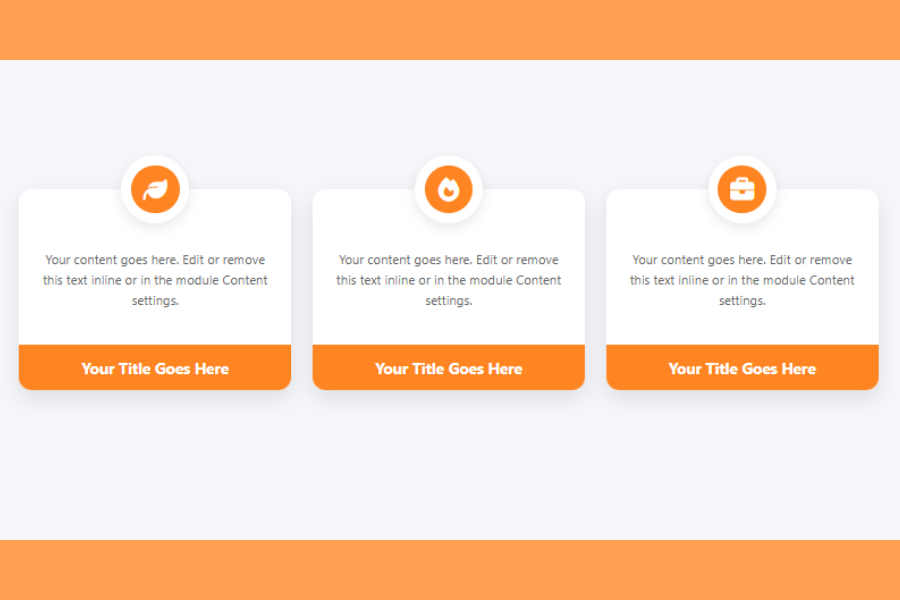
This design features cards for displaying information. Each card contains an icon, description and a title. This layout is widely used in web design as it is easy to read, well-balanced and user-friendly.
A great feature of this design is the floating icon. The icon is positioned above the card, which gives it a unique and artistic touch. The gentle shadows, rounded corners, and light colors make the design elegant and attractive.
Overall, this design is a good example for UI designers to learn how to create reusable components with HTML and CSS.
HTML Structure
The HTML structure is used to organize the content on the page. It begins with the basic HTML5 document structure, which makes sure the webpage is compatible with all browsers.
Within the , meta tags are used to set the character encoding and responsiveness. These ensure that the website works well on mobile devices such as smartphones and tablets. There’s also a title that shows up on the tab in the browser.
A library called Font Awesome is imported in the head. It contains the icons used in the cards. The icons are added by using class names, rather than images, to keep the design lightweight and manageable.
The element is the main content of the page. It has a flexible box layout to align the cards both horizontally and vertically. Several card elements are stacked next to each other.
There are three parts to each card. The first is the icon container, which contains the icon within a circular container. The container is absolutely positioned above the card to give it a floating appearance.
The second is the card body. Here, there is a paragraph with details about the feature or service. The paragraph is clear and straightforward.
The third part is the card footer. It is used to display the card’s title. It is highlighted with a different background colour.
The design is clean and tidy, and can be reused and extended easily.
CSS Style
The CSS makes the design look appealing and responsive. It begins with a reset to remove default margins and paddings for cross-browser compatibility.
The body has a pale background and flexbox is used to center the cards. Gaps between the cards are created to enhance spacing.
The cards have a white background, rounded corners and a subtle shadow. This gives it a “card” appearance. The card also has some margin at the top to accommodate the icon.
The icon container is absolutely positioned. It is horizontally centred and positioned just above the card. Within the circle is another circle that holds the icon. This gives the icon a more attractive appearance.
The icon is created using FontAwesome. It resides in the inner circle with white color and the circle background is orange. This provides contrast and makes it stand out.
The content of the card is presented using a medium-sized font and lighter tone. This makes it easy to read but not too overwhelming. The line height enhances its look.
The card footer is given a solid orange background colour. It displays the title in white text, providing a contrast. Only the lower portion of the card has rounded corners, for a clean look.
Hover Effects and Interaction
An interactive hover effect is implemented. When the user’s mouse hovers on a card, it animates upward. This gives the card a “hover” effect.
The background of the footer also slightly changes its color. This subtle change provides user feedback and improves the user experience.
It’s all smooth because of CSS transitions. These transitions are not too flashy but effective to make it look modern.
Overview
This feature card design is a great example of how simple HTML and CSS can be used to create a clean and professional UI component. It combines structure, spacing, colors, and small animations to build a user-friendly design.
The use of icons, floating elements, and card layout makes it visually appealing. At the same time, the design remains simple and easy to understand.
This project is ideal for beginners who want to learn UI design basics. It can also be extended by adding more features, animations, or JavaScript for advanced functionality.
In real-world applications, this design can be used for service sections, product features, or any content that needs to be displayed in a structured and attractive way.
Source Codes[Scroll Down]
From here, you can download the source code files for this Bakery Website Hero Section by clicking the download button provided below.
The source code is completely free and can be reused or modified for your own projects.
Click here –Unique Hover Card Design Using HTML and CSS with Modern UI and Interactive Effects