In this modern digital age, a attractive and convenient web site has a major role to play in drawing customers particularly in fast food and online delivery business. The given project is a contemporary web design of the fast food store, which is designed with HTML and CSS, and it is not only beautiful but also convenient.
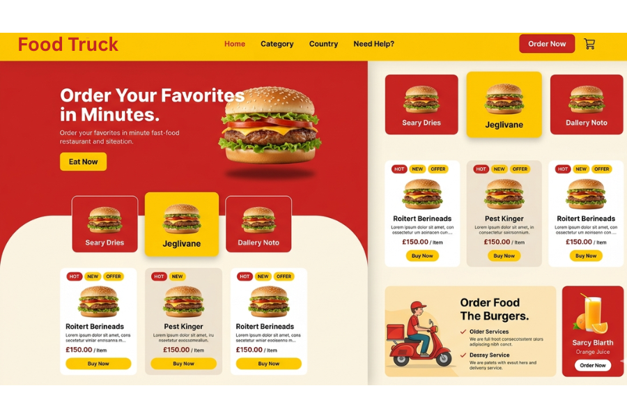
The interface is boldly coloured with layout structure and interesting sections which include a hero banner, food cards and promotional sections. It is realistic resembling the real food delivery sites that provide a user with a hassle-free browsing and present goods appealingly.
The project can be recommended to front-end developers who are willing to enhance the skills in layout design, responsive styling, and UI development. Using a simple HTML structure and an innovative CSS styling, it shows how simple technologies may be utilized to create professional and portfolio-ready web designs.
HTML – Structure and Content Organization
The HTML component of this project provides the base of the web site and organizes all the aspects in a neat and sensible manner.
It has a header part consisting of navigation links and a call-to-action button, then a hero part where the most important message is emphasized in a big headline and image. The primary content area is split into various areas including category cards, food products listing, and a promotional delivery banner.
Every section is well organized with the help of semantic elements and div containers to ensure the clarity and scalability. This is aided by the use of headings, paragraphs, pictures, and buttons which make the content user friendly and easy to follow.
CSS Visual styling and Modern layout design
The CSS makes the whole design lively with the use of bright colors, spacing and modern UI elements.
The custom color variables are applied to ensure that the design is consistent throughout the design, and flexbox and grid layouts allow the alignment of content to be efficient. The interface is provided with rounded corners, shadows and hover effects that give it a premium feel.
The responsive design will make sure that the layout is responsive across various screen sizes. The grid structures and spacing are manipulated by media queries as the site is made tablet and smaller device-friendly without having to alter the design.
Source Codes[Scroll Down]
From here, you can download the source code files for this Bakery Website Hero Section by clicking the download button provided below.
The source code is completely free and can be reused or modified for your own projects.